Evo Energy
Solar Energy Installation Company
Role
UX/UI Designer
Collaborators
Ashley Dager
Tools
Figma, Asana
BRIEF
Evo Energy is a solar installation company looking to expand its reach in the Bay Area. Evo energy believes that solar energy makes the world a better place by reducing CO2 in the air. Currently, the company gets most of its leads from yelp and referrals. Evo energy is looking to expand its online reach by redesigning the website.
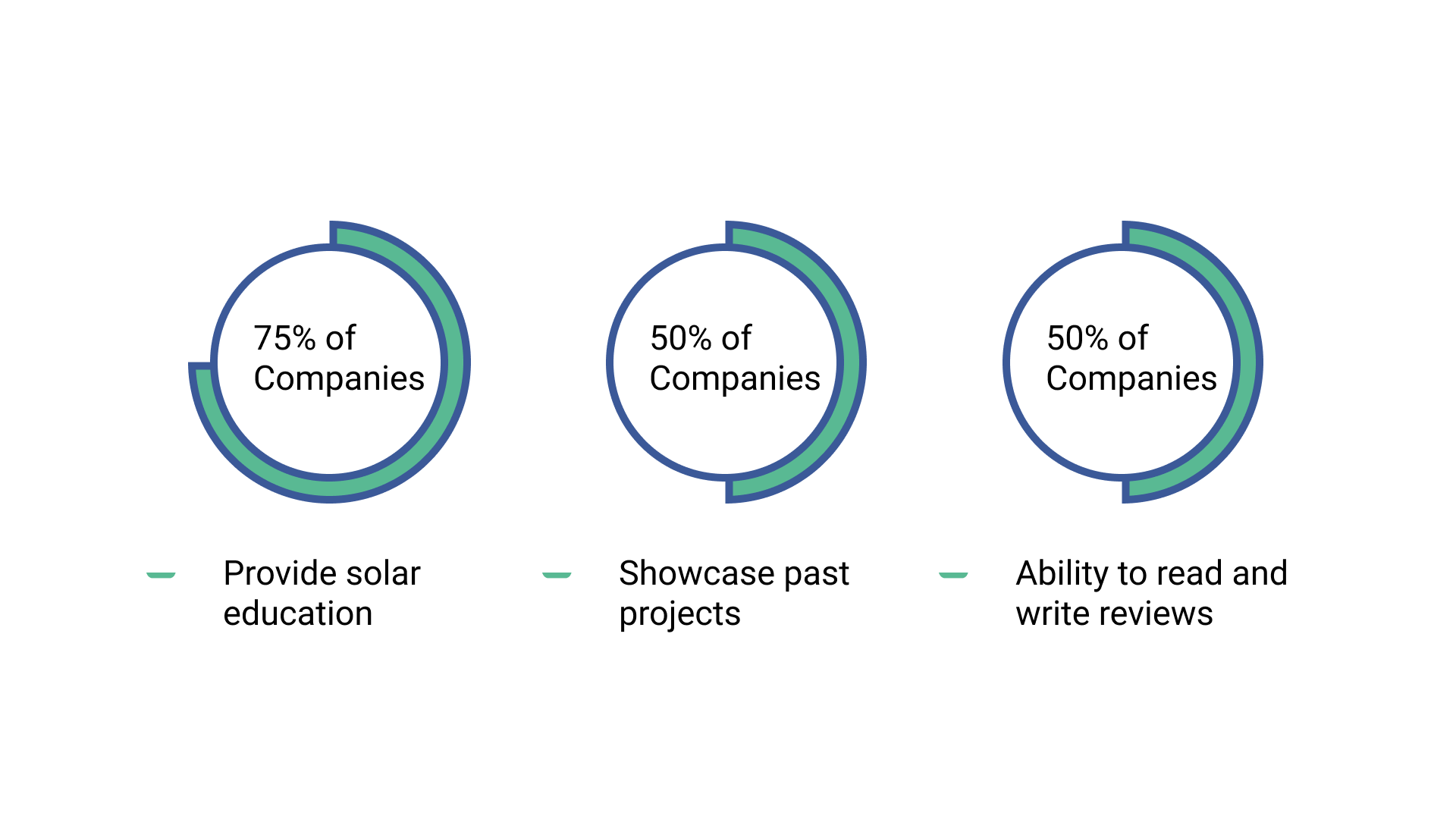
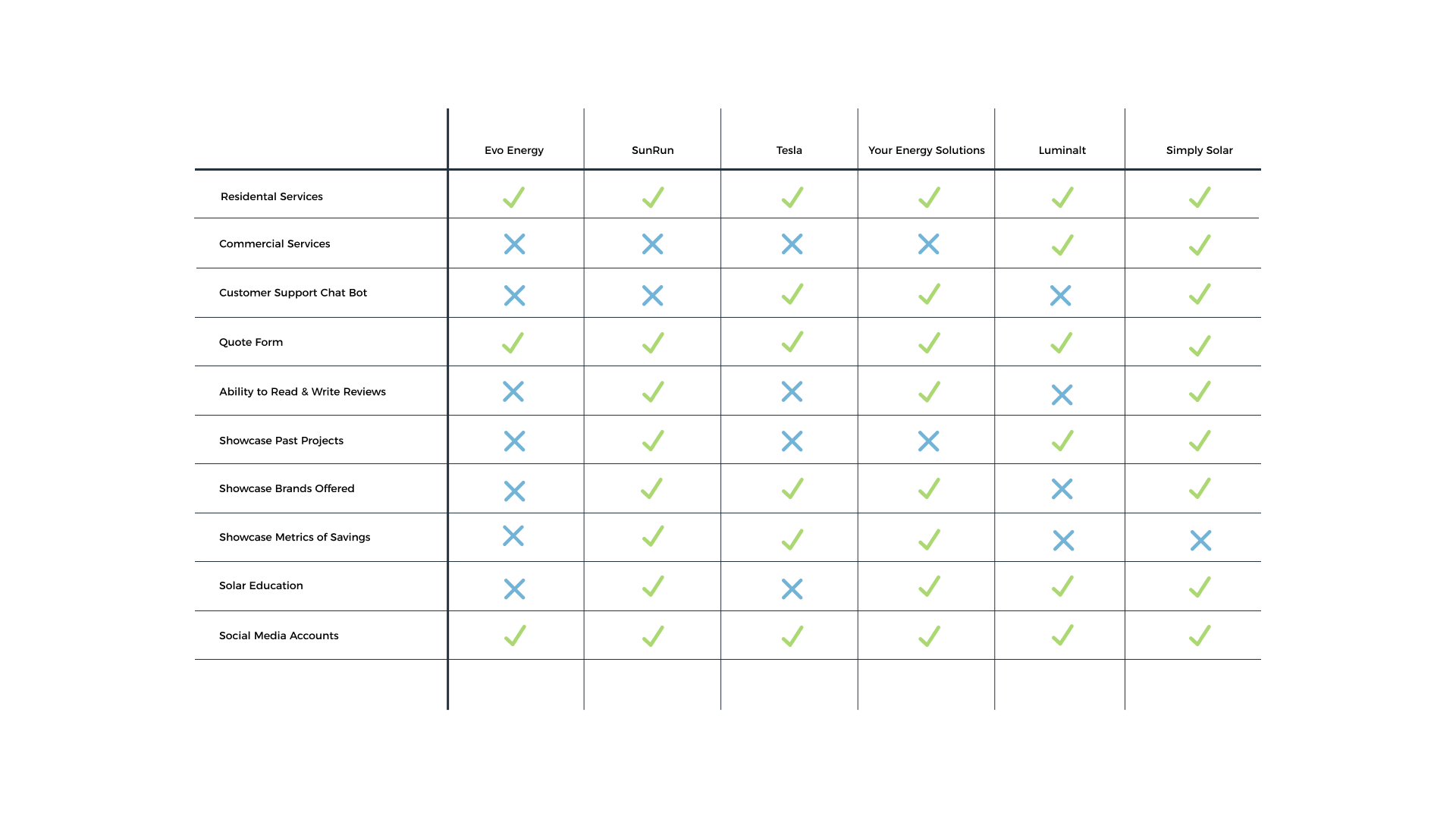
COMPARATIVE ANALYSIS
We begin our research by comparing six solar installation companies in the area. We learned that 5/6 companies provide solar energy education, 3/6 companies use a chatbot and 3/6 companies display customer experience from past projects. This information helped us understand discover industry standards.
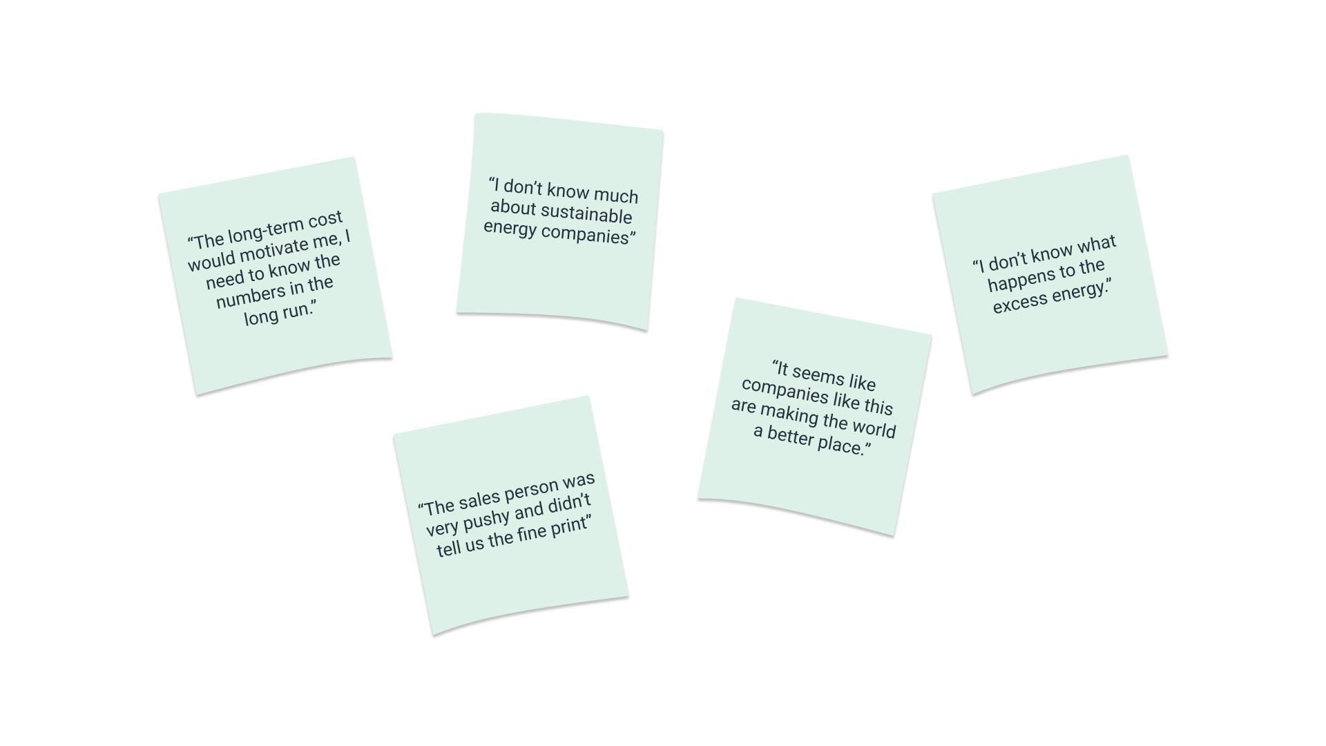
USER INTERVIEW
We interviewed six homeowners and asked them how much they know about solar energy. We learned that six out six homeowners had been offered solar installation services, yet knew very little about how solar energy works. The common believe is that installing solar panels is highly expensive.
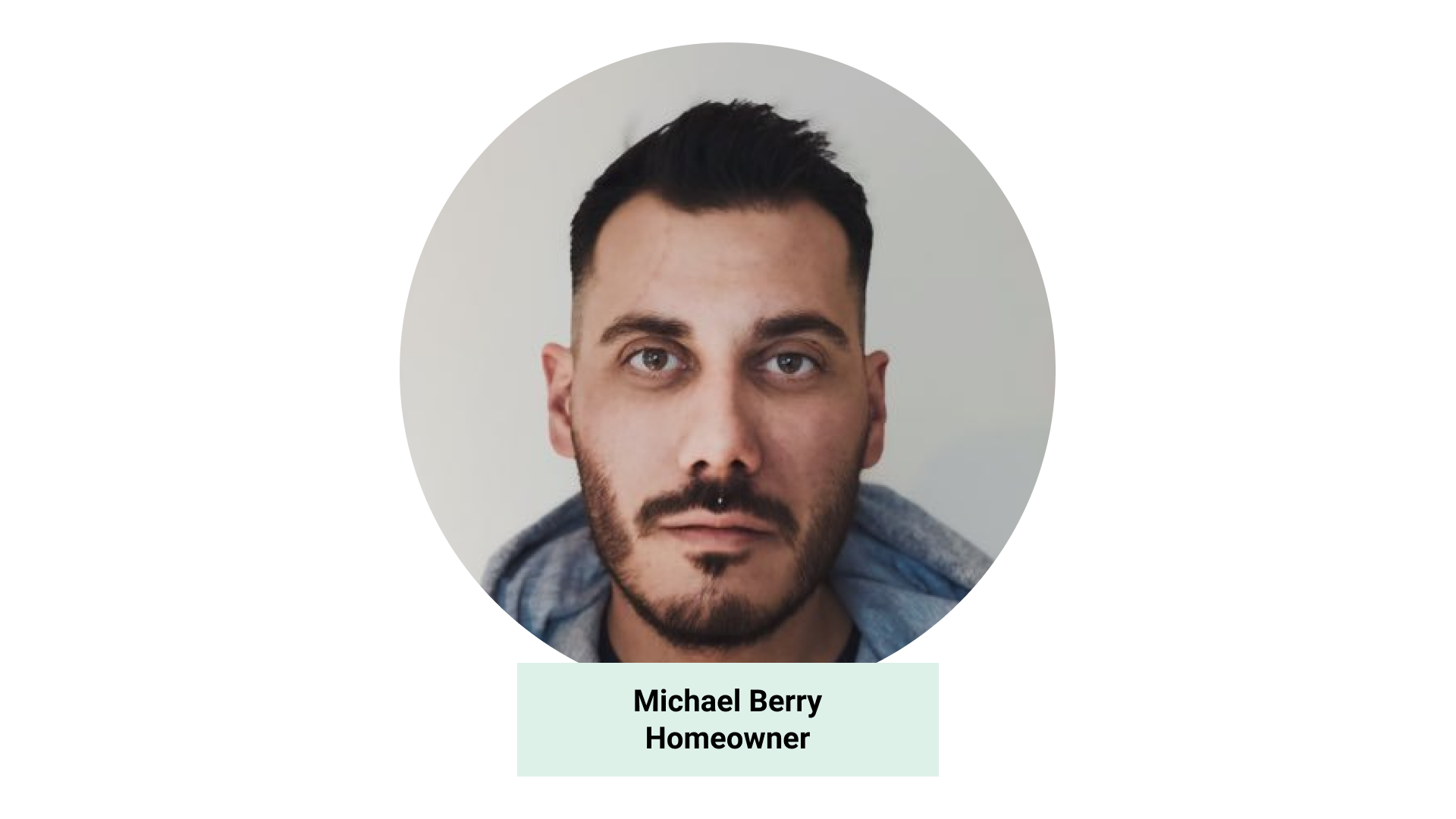
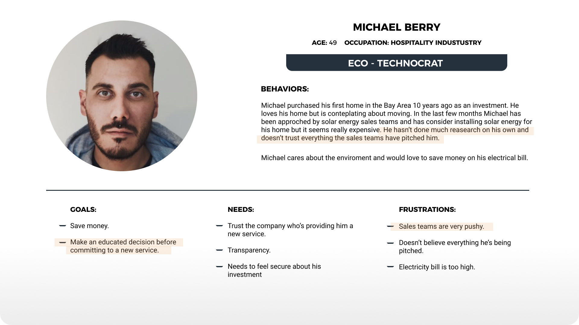
USER PERSONA
Our user persona represents an archetype created from the findings from our six interviews. We learned that users need comprehensive education from solar installation companies so that they can make an informed decision when investing in solar energy.
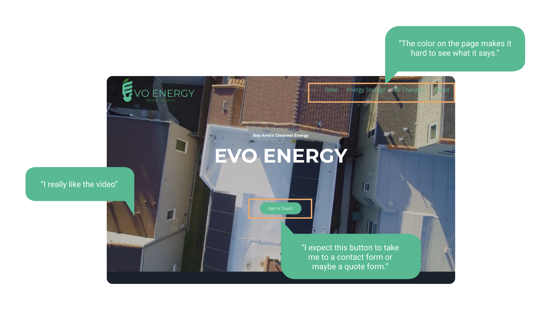
CURRENT SITE USABILITY TEST
We asked homeowners to navigate the current site. We watched them click on the different sections of the site and asked them questions about how this site made them feel.
Usability test findings:
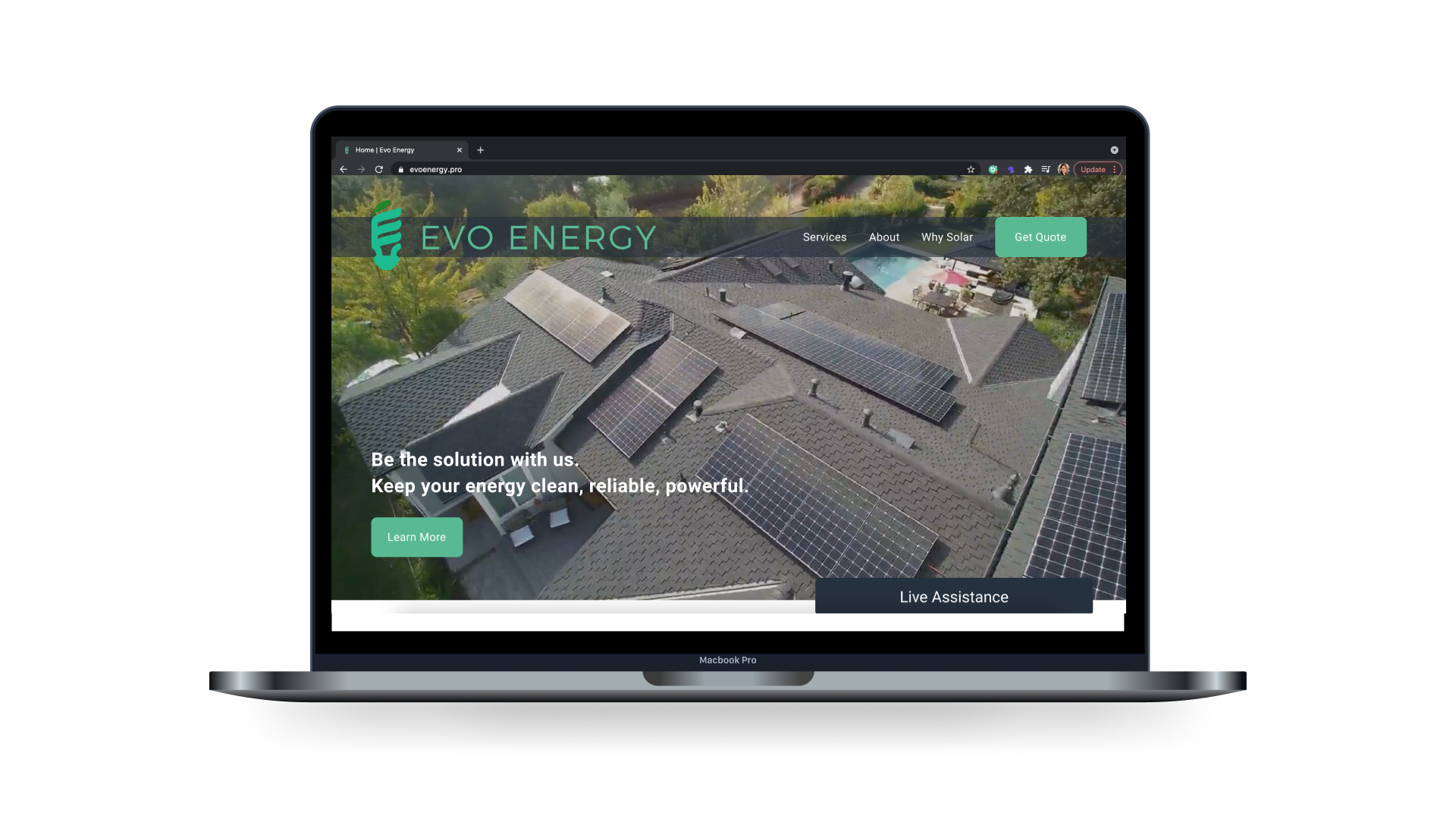
- Users were enthusiastic about the imagery on the site, especially the drone shot on the home page.
- When clicking on 'Get In Touch', users expected to be linked to a form but instead, they were sent to the about page.
- Users were enthusiastic about the imagery on the site, especially the dron shot on the home page.
- The navigation bar was hard to see due to the low color contrast.
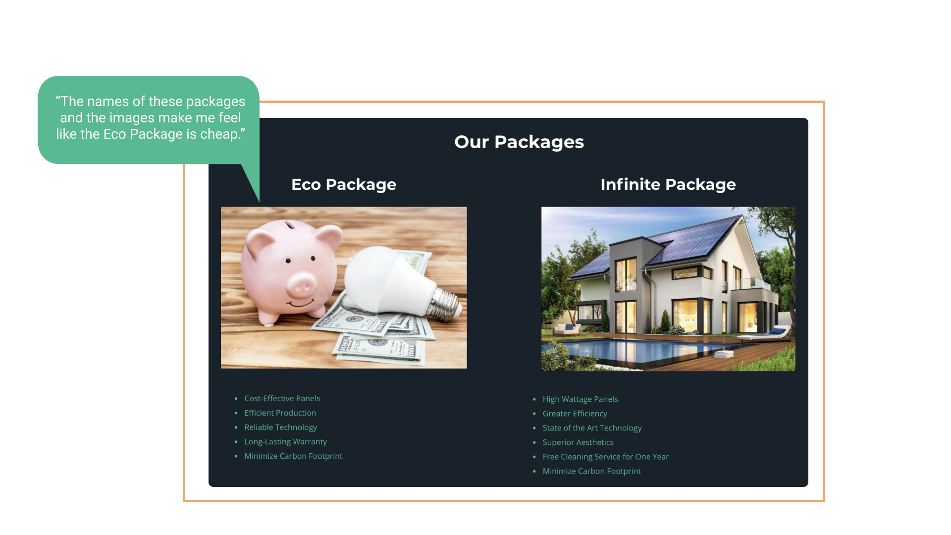
- Users feel that getting solar installed in their homes is an expensive investment. Therefore when they saw an eco-package with a piggy bank, it made them feel like the quality of the product would decrease. Which made the package less attractive.
- The quote form repetitive.
SOLUTION
After recognizing the problem we begin sketching for solutions. While creating these drawings we took into consideration current site usability tests and user interviews. We added a chatbot feature and a section for reviews and we made the navigation bar stand out by adding a rectangle behind the navigation links.
MID-FIDELITY WIREFRAMES
Inspired by our sketches we created a greyscale design and prototype it for testing. During testing, we found that users were able to easily navigate the site and complete tasks without failure. Users said, " the site it's intuitive".
HI-FIDELITY PROTOTYPE
Using the findings from our mid-fi testing, we created a hi-fidelity prototype. In the hi-fidelity prototype we focused on brand colors, consistancy through out the website, images, and content placement.
NEXT STEPS
- Test “Live Assistance” feature for ease of use & intuitive user understanding.
- Overhaul all site copy and test for user comprehension & overwhelm.
- Test images and icons for user understanding & content relatability.
- A / B test logo designs for brand cohesion & user delight.
Selected Works
Fitness AppZenoti
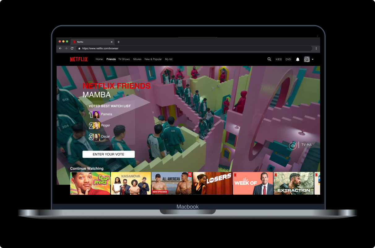
Netflix FriendsProject type
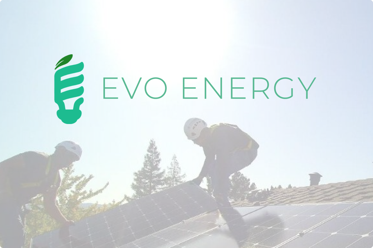
Evo EnergyWebsite Redesign
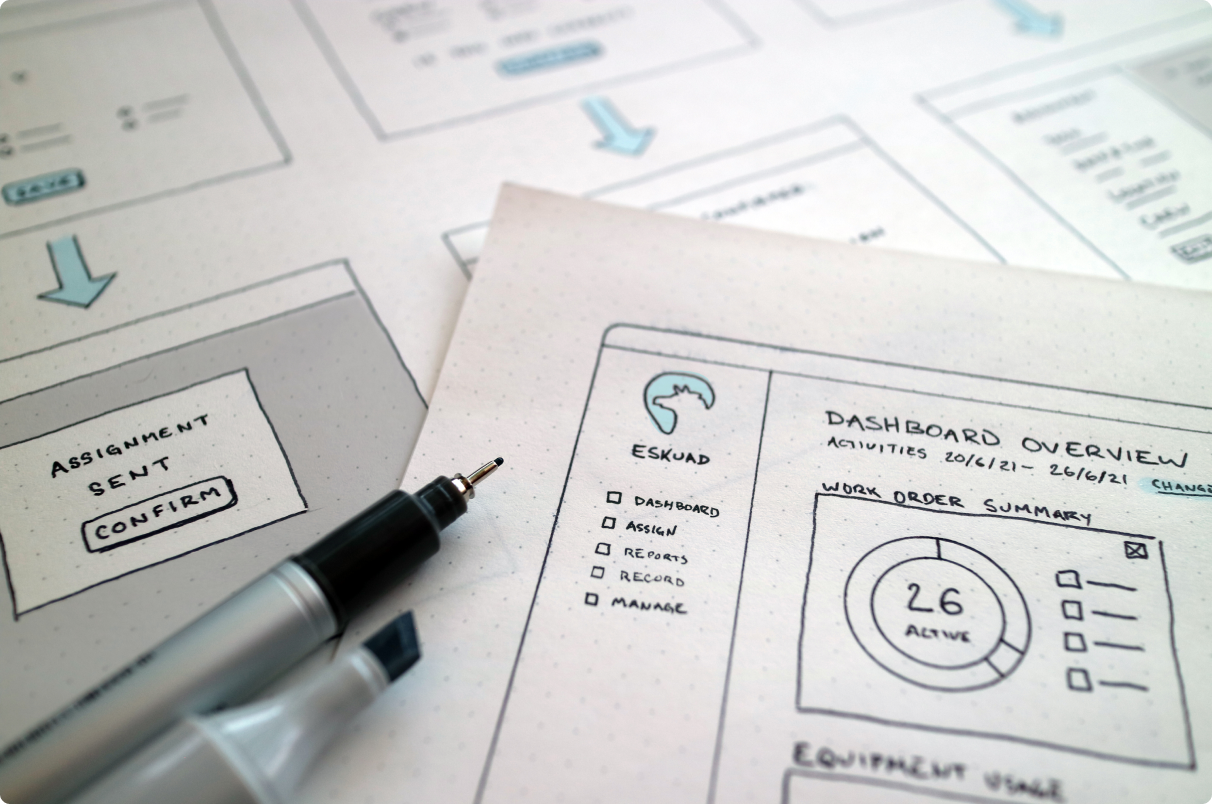
Eskuad Data AutomationFreelance Experience